3M
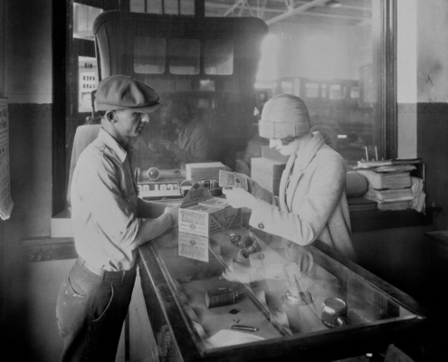
Woman purchasing sandpaper packaged and sold at auto paint shops and hardware stores. (Photo courtesy of 3M)
Origin Story
The 3M Company began in 1902 in Two Harbors, Minnesota. Originally the company bore the name Minnesota Mining and Manufacturing Company which was later shortened to just 3M. When it was founded it was primarily focused on mining for a mineral called corundum, which at the time was ideal for making sandpaper and grinding wheels. Turns out, what they thought was corundum was really another low-grade mineral called anorthosite. Three years later the company moved to Duluth to focus on manufacturing sandpaper products having found a suitable use for this newly discovered mineral.
When 3M began in 1902, the five founders had a simple goal to mine for a mineral ideal for making sandpaper and grinding wheels. Turns out, what they thought was corundum was really another low-grade mineral called anorthosite. Discovering the poor-quality mineral could have caused an early end to our fledgling company, but our founders persisted. Why? Because something more important was born that first year: the spirit of innovation and collaboration that forms the foundation of 3M today. So instead of calling it quits, we turned to different materials, applied them to other products, gained the trust of important investors and built up sales little by little.
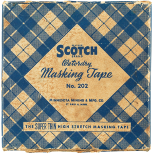 Scientific, technical and marketing innovations produced success upon success over the years, eventually making 3M a constant name on the Fortune 500 list. Today, more than 60,000 3M products are used in homes, businesses, schools, hospitals and other industries. One third of our sales come from products invented within the past five years, thanks to innovations from the thousands of researchers and scientists we employ around the world. With corporate operations in 70 countries and sales in 200, we are committed to creating the technology and products that advance every company, enhance every home and improve every life. As the company evolved so to did the brand identity. Over the years 3M has seen over 20 different versions of the logo take shape as well.
-
1906 – 1938
The first logo was designed at the beginning of the twentieth century. It was a solid black rhombus with a white “3 M Co” inscription on it. The Diamond was enclosed in a double circle frame, where the long company’s name was written in all capitals.
-
1926 – 1938
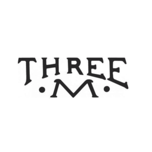
Two additional versions of the logo were created in 1926. One of them was a simple inscription “Three M” with two solid dots from both sides of the letter.
-
1937 – 1942
The version introduced in 1937 started a whole new era in the history of the 3M logo. Now, there were only two bold black characters and a hyphen in between. The design was minimalist and easy to grasp.
-
1938 – 1942
The original logo was still in use in 1938, but the typeface was refined and changed to an elegant serif one. However, the secondary logo, which resembles the one we all know today, was also designed to accent on the company’s progress and growth.
-
1942 – 1944
As preferences in fonts evolved so too did the 3M logo. In 1942 a slab serif version of the logo was introduced. Shadows to were also added to give the logo a 3 dimension appearance.
-
1944 – 1948
In 1944 they continued the simplification process that they worked on in 1937. This version although based on a sans serif font had a hand drawn appearance.
-
1948 – 1950
In 1948 they cleaned up the logo they had begun developing in 1944. During this process they removed the hyphen as they had in 1942. This cleaned up this typographic version to look much more refined.
-
1950 – 1951
In 1950 a version of the logo was produced that carried over the same slab serif font and three dimensional treatment as the logo from 1942. This circle element was likely a nod to the original seal style logo of 1906. Additionally the word "Company" was added below the name.
-
1951 – 1954
In 1951 the dimensional logo was removed from the circle and the word "Company" was also removed. This lighter treatment set the stage for future versions where the words were reversed out on a dark background.
-
1952
The logo introduced in 1952 was likely the most dramatic change of previous versions. It introduced a more compressed typeface. This font was much more geometric in form and the line weight of the characters was consistent. There are similarities between this version and the current version of the logo.
-
1952 – 1954
About the same time that the clean compressed version of the logo was introduced they took the version from 1950 combined it with the version from 1951 and changed the word below the company name to read "Brand". This change was likely a response to increased diversity in the products 3M was producing.
-
1953 – 1954
In a somewhat alarming change, the word "Line" was added below the company name in a rather unusual rope style font. This version was short lived and changed soon thereafter.
-
1954 – 1955
in 1954 the same logo introduced in 1952 was used but olive branches were added to the outer edge of the logo and the word "Brand" was changed back to "Company".
-
1954 – 1957
The same year the olive branches were added to the logo they produced a version without the olive branches that had more or less the same look and feel.
-
1955 – 1957
In 1955 3M had begun researching a new line of products. This innovative spirit was reflected in a new version of the logo that informed customers the company was expanding.
-
1955 – 1958
In 1955 the version of the logo from 1954 was used again with very little changes visually from the original olive branch version. It is unclear if this was just due to old products in circulation but the olive branches reappeared yet again in 1958 so the change does seem intentional.
-
1956 – 1957
In 1956 3M released another minimalist version of their logo that most closely represented the current version. The font style and weight were likely the inspiration for the logo that we see today.
-
1957 – 1958
In 1957 a version of the reversed out logo from 1954 was introduced that had certain similarities to the logo produced in 1950. The main difference was the weight of the outer border and a change to the word below the company name.
-
1958 – 1960
In 1958 the olive branches were reintroduced to the logo but the shape of the oval was modified. The word "Brand" was maintained from the previous version.
-
1960
In 1960 there was virtually no change from the previous olive branch version except for the word "Brand" was replaced with the word "Company". It is likely that both these versions were used at the same time but for different brand applications.
-
1960 – 1961
The logo introduced in 1960 removed the olive branches and circle element but maintained the soft serif typeface from the previous versions. Since the font no longer needed to be contained in a shape the height was increased and extra weight was added.
-
1961 – 1978
In 1961 3M released a version of the logo that reintroduced the slab serif font. It also added a brand element below the letter "M" that likely carried over from one of their product brands.
-
1978 – Present
The shape of the 3M logo is very simplified: 3 and letter M are situated very close to each other and have a much more impressive font which adds to the logo more power, status and intensity.
